Guelph Public Library —
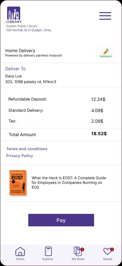
Home Book
Delivery App
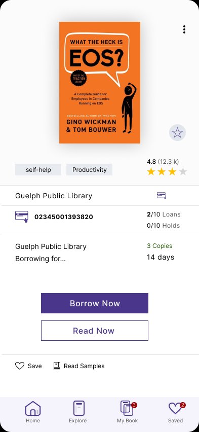
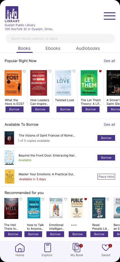
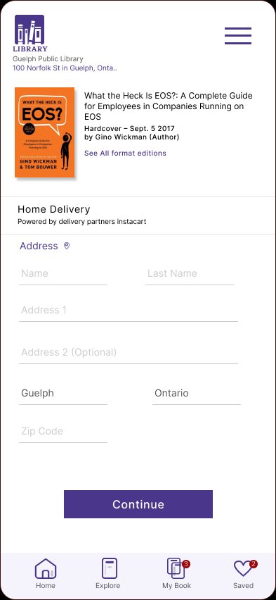
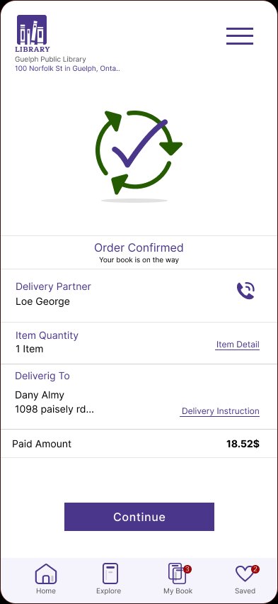
Redesigning how library members borrow, manage, and receive physical books — from browsing the catalogue to home delivery in one seamless mobile experience.
89/100 SUS Score
13 min ETA
Live Tracking