20-Minute
Medicine
Delivery App
Designing a fast, trustworthy mobile experience for patients who need medicines at their door in under 20 minutes — with live delivery tracking from order to doorstep.
89/100 SUS Score
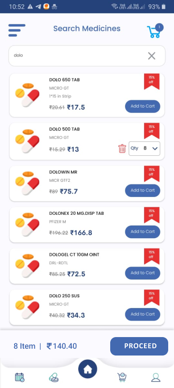
Smart Search
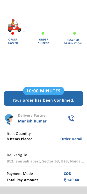
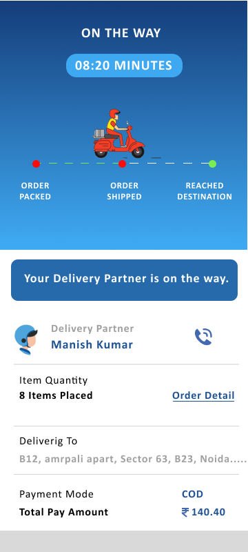
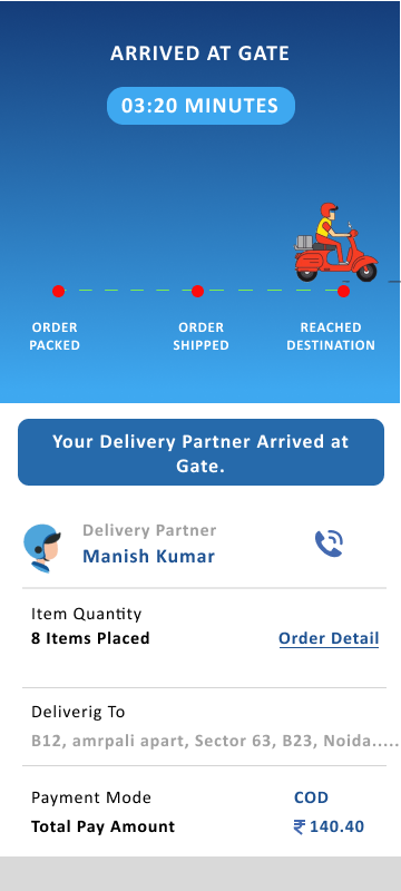
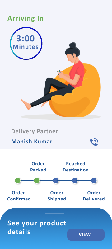
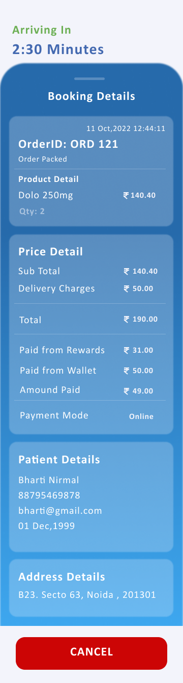
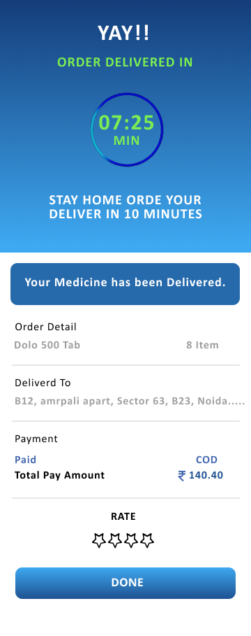
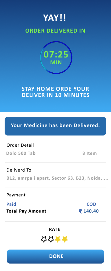
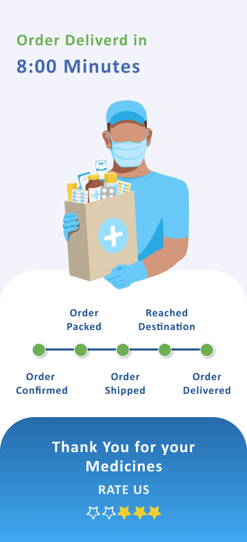
Live Tracking